- CALL NOW! (847)-604-4321
- info@apexsignsandgraphics.com

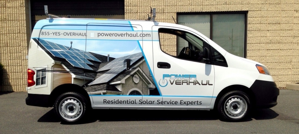
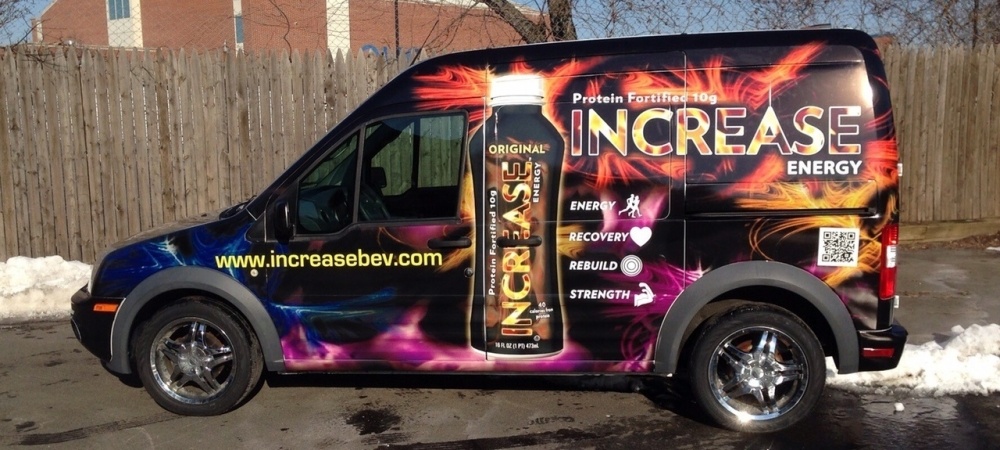
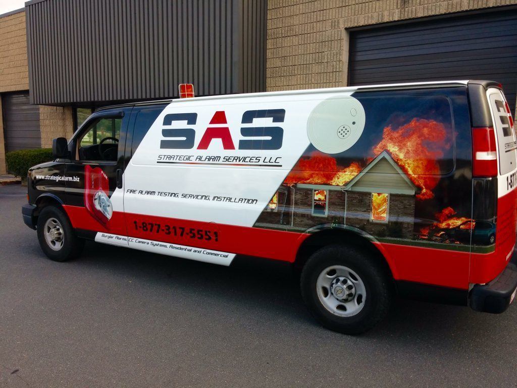
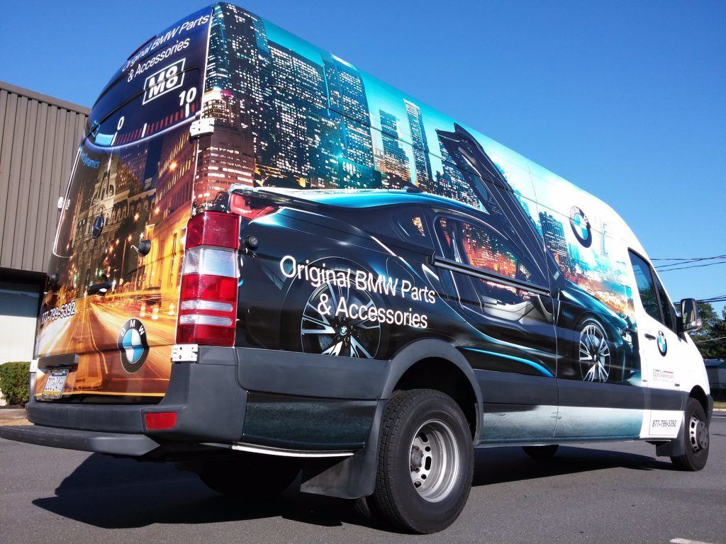
Do you want your mobile marketing message to stand out? Are you willing to attract the eye and perhaps even shock the audience with graphics to get a brand buy-in? Tread lightly! Our vehicle branding graphic design specialists weigh in on some common wrap design mistakes – and how to avoid them.
Readable Fonts Stand Out; Avoid the Scripts
 Script fonts are the selection of choice for some business owners who want to stand out from the crowd of wrapped vehicles with Arial, Impact, and similar font selections. In some situations, the script fonts are part of the company’s brand message. While it is a good option for the display of your firm’s name, business clients should think twice before asking for their website addresses, social media handles, and emails to show in the same way.
Even though it provides a perfectly matched design, it fails to communicate while you are driving down the street at speeds exceeding ten miles an hour. Those seeing the graphics package may not be able to differentiate the “c” from the “e,” “a” from the “u,” and similar appearances. When a consumer jots down the wrong information, s/he is unlikely to try several different combinations to contact you.
If Your Background is Too Busy, It Fails
 Wraps work so well because they present color contrasts for the name and logo display, attract attention with eye-popping hues, and support the brand message of the corporate presentation. But when you combine too many style elements, the wrap’s design becomes chaotic. Think of a paisley wallpaper pattern with a striped carpet, and large floral pattern upholstery. Putting it all together in a small room is overpowering, and you lose the fine points of all these designs. The same applies to a vehicle wrap. If it is so visually “loud” that it overpowers your message, the consumer will notice you – but for all the wrong reasons. And s/he most likely will not take in your brand message.
Sex Sells, But Not on Vehicle Wraps
 What you put up inside your business is not the same as what you might put on a vehicle wrap. Although magazines are filled with bikini-clad models next to cars, these graphics do not translate well to a mobile marketing approach. For starters, your wrap has to appeal to a broader demographic. And since these photos are deemed to be inappropriate by many, it is unwise to alienate this segment of your consumer group. Moreover, depending on the nature of your wrap’s design, you may be asked to leave certain areas. When your messages include questionable double entendres or graphics, your business’ message may not be welcomed near schools and parks. Do you really want to stand out in this way?
For other vehicle branding graphic design mistakes, and how to avoid making these errors in judgment yourself, contact our specialists to learn more. We help you put together the right appearance that suits your business, appeals to a chosen demographic, and will make you stand out – in all the right ways – no matter where business takes you. Call us today!
Categories
- 3D Letter Signs
- A-Frame Signs
- Acrylic Signs
- Ad Campaigns
- ADA Signs
- Advertising Signs
- Banner Stands
- Banners
- Braille Signs
- Branded Coolers
- Branded Tents
- Branding
- Building Signs
- Business Signs
- Cabinet Signs
- Cafe Barriers
- Channel Letter Signs
- Commercial Sign Business
- Commercial Vehicle Products
- Customized Signs
- Decals
- Digital Prints
- Dimensional Letter Signs
- Directional Signs
- Directory Signs
- Etched Vinyl Privacy Film
- Event Displays
- Event Graphics
- Exterior Signs
- Fabric Banners
- HDU Signs
- Interior Signs
- Labels
- Lawn Signs
- LED Signs
- Lobby Signs
- Mobile Marketing
- Monument Signs
- Office Signs
- Pantone Colors
- Point of Purchase Signs
- Post and Panel Signs
- Posters
- Real Estate Signs
- Reception Area Signs
- Retail Store Signs
- Retail Store Window Graphics
- Retractable Banners
- Sandblasted Signs
- Sidewalk Signs
- Sign Companies
- Sign Permits
- Sign Shop
- Sign trends
- Stickers
- Suite Signs
- Trade Show Displays
- Trade Show Flags
- Trade Show Products
- Tradeshow Signs
- Uncategorized
- Vehicle Graphics
- Vehicle Lettering
- Vehicle Magnets
- Vehicle Wraps
- Vinyl Banners
- Vinyl Graphics
- Vinyl Lettering
- Vinyl Window Lettering
- Wall Graphics
- Wall Murals
- Wall Signs
- Wayfinding Signs
- Window Decals
- Window Graphics
- Window Lettering
- Window Wraps
- Yard Signs
Recent Posts
-
Directory Signs and Wayfinding Signs are a Perfect Combination
June 15, 2017
-
Window Graphics are a Great Option for Your Storefront
June 13, 2017
-
How to Make the Most of Lawn Signs
June 08, 2017
-
The Perfect Combination for Outdoor Event Displays
June 06, 2017


